We’ve all been there—you’re on a website or scrolling through social media, and suddenly, you see a button or link that grabs your attention. It says something like “Sign Up Now” or “Get Your Free Guide.”
Before you know it, you’re clicking away, either signing up for a newsletter or downloading an ebook. That, my friend, is the power of a Call-to-Action (CTA). In simple terms, a CTA is a marketing tool designed to get you to do something.
It might be clicking a button, filling out a form, or making a purchase. It doesn’t matter if it’s through a website, an email, or an ad, a well-placed CTA can be the difference between a user bouncing off your page or converting into a loyal customer.
Let’s break it down: What exactly is a CTA, why are some so effective, and how can you create your own to get people to take action?
What Is a Call-to-Action?
At its core, a CTA is like a guidepost for your audience, directing them toward a specific action you want them to take. It could be anything from downloading a free resource to purchasing a product.
The form and type can vary—a bold button on a website, a link in an email, or even a simple sentence at the end of a blog post. The goal? To motivate users to take the next step in their journey.
Whether they’re learning more, buying something, or signing up for a free trial, the CTA is the gateway to conversion. It’s all about making the path forward clear and enticing.
Key Ingredients of an Effective CTA
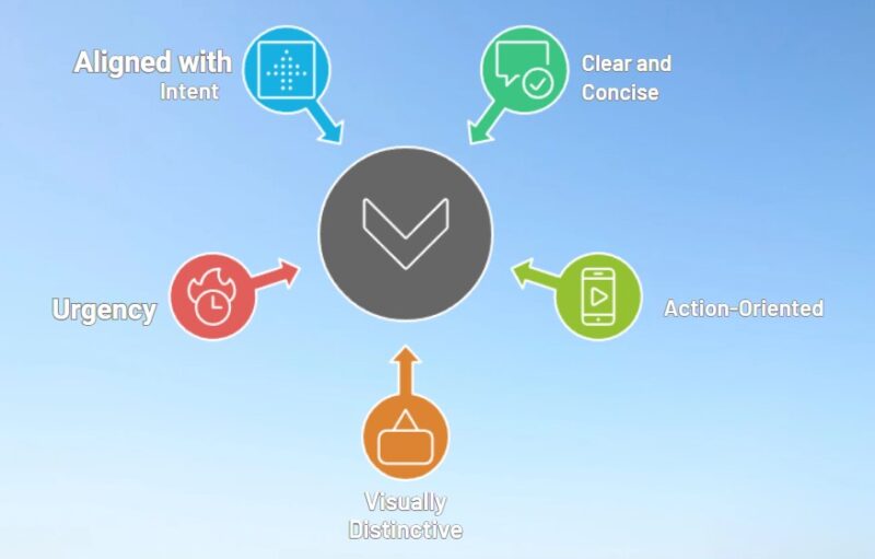
You might think slapping a “Click Here” button on your page is enough, but not quite. A great CTA has a few key characteristics that make it stand out:
- Clear and concise: Simple and direct language, like “Download Now” or “Start Your Free Trial,” tells users exactly what they’re getting.
- Action-oriented: Verbs drive action, and words like “Get,” “Subscribe,” or “Buy” give clear instructions.
- Visually distinctive: Using contrasting colors, bold fonts, or strategic placement ensures your CTA catches the eye.
- Urgency: Time-sensitive CTAs like “Limited Offer” or “Last Chance” can push users to act fast.
- Aligned with intent: Make sure the CTA matches the user’s needs at that moment. If they’re just browsing, something like “Learn More” might be better than “Buy Now.”
Now that we’ve got the basics down, let’s take a look at some real-life examples of CTAs that work—and why.
Real-Life CTA Examples and Why They’re So Effective

“Try for Free” – Dropbox
Dropbox is famous for its “Try for Free” CTA, and it’s easy to see why it works. Offering a free trial reduces the perceived risk for users who aren’t sure if they’re ready to pay for the service.
This CTA makes it super easy for users to give Dropbox a spin with no strings attached. The key here? Free. People love free stuff, and the idea of trying something without committing any money is often all the motivation they need to click.
“Get Started” – Shopify
Shopify’s CTA, “Get Started,” is another example of simplicity done right. Instead of bombarding potential users with a long, complicated message, it gets straight to the point. The action is simple: start your online store.
No fuss, no extra steps—just a clean, straightforward invitation. By reducing the friction and making it feel effortless, Shopify boosts the chances that someone will follow through and start their ecommerce journey.
“Sign Up for Free” – LinkedIn
LinkedIn’s “Sign Up for Free” is brilliant because it combines action with reassurance. The phrase “Sign Up” encourages users to take the first step, while “for Free” assures them that they won’t have to part with their cash just yet.
For a platform that thrives on membership and networking, this CTA is perfect for drawing in new users who may be hesitant to commit without first seeing the value. It’s all about removing obstacles—especially financial ones—and getting people through the door.
“Learn More” – HubSpot

HubSpot nails the CTA game with “Learn More.” This is for the curious, the ones who aren’t ready to commit but want to know more before making a decision. HubSpot recognizes that not every visitor is ready to buy right away.
Some might still be exploring options, and this CTA meets them where they are in their decision-making process. Instead of pushing a hard sell, HubSpot uses a gentle nudge to encourage users to keep moving forward in their journey. It’s a small step, but an important one.
“Join Free for a Month” – Netflix
Netflix’s “Join Free for a Month” might be one of the most well-known CTAs out there, and it’s a masterclass in removing barriers to entry.
Giving people access to the full service for free with no commitment allows them to experience the platform firsthand, which often leads to conversions once they see the value Netflix offers. It’s about creating value upfront, letting users test the waters before diving in fully.
“Reserve Your Seat” – Eventbrite
When it comes to events, Eventbrite knows how to make people feel like they’re missing out. Their CTA, “Reserve Your Seat,” taps into the fear of missing out (FOMO) by creating a sense of exclusivity and urgency.
People are more likely to act when they believe spots are limited, which makes this CTA so effective. By making it clear that time is running out, Eventbrite gives users an extra push to commit.
Why Effective CTAs Work
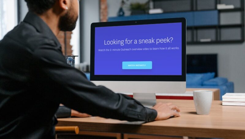
There’s a method to the CTA madness. The most effective CTAs aren’t just random buttons or links—they tap into basic human psychology. Here’s why they work so well:
They Make Decision-Making Easier
In a world full of options, decision fatigue is real. A good CTA eliminates that mental load by clearly guiding users to the next step. Instead of wondering what to do next, a well-placed CTA provides that gentle nudge, making the decision process seamless.
They Tap into FOMO
No one wants to miss out on a great deal or opportunity. CTAs that create urgency, like “Only a Few Spots Left” or “Offer Ends Soon,” push users to act quickly before they lose out. It’s a simple trick, but it’s incredibly powerful.
They Match Where the User Is
An effective CTA meets people where they are in their journey. Someone just learning about your product isn’t ready to buy yet, but they might be interested in “Learning More.” Tailoring your CTA to their current mindset increases the likelihood of conversion.
They’re Easy to Spot
If users can’t see your CTA, it doesn’t matter how compelling it is. Placement matters. CTAs are most effective when placed in high-visibility areas, like at the end of blog posts, in prominent banners, or as sticky buttons that follow users as they scroll. Make sure your CTA is easy to find, or it might get lost in the noise.
They Offer Value
CTAs that highlight what the user will gain—like “Get Your Free Ebook” or “Start Your Free Trial”—are far more enticing than a generic “Click Here.” People want to know what’s in it for them, and a CTA that clearly conveys the value they’ll receive is more likely to get a click.
How to Create Effective CTAs
Now that we’ve seen what works, let’s talk about how you can create your own killer CTAs. Here are a few tips to get you started:
1. Know Your Audience
Who are you talking to, and what do they need at that moment? A new visitor may need more information, while a returning customer might be ready to buy. Tailor your CTA to where they are in their journey. Also, you should define brand’s voice.
2. Be Clear About the Next Step
Ambiguity kills conversions. Make sure your CTA clearly tells users what will happen when they click. If they’re downloading a guide or signing up for a free trial, let them know upfront.
3. Test and Optimize
Don’t be afraid to experiment. Try different CTA wording, placements, and designs. Run A/B tests to see what resonates best with your audience, and use that data to make improvements over time.
In Summary
A well-crafted Call-to-Action can make or break your marketing efforts. Whether you’re trying to get someone to sign up, make a purchase, or learn more, a strong CTA can guide them down the path to conversion.
Keep it clear, make it actionable, and always think about what your audience needs. After all, the right CTA is often the final nudge they need to take action.
